Tuesday 8 March 2011

100 Years of Paper Poster for GF Smith


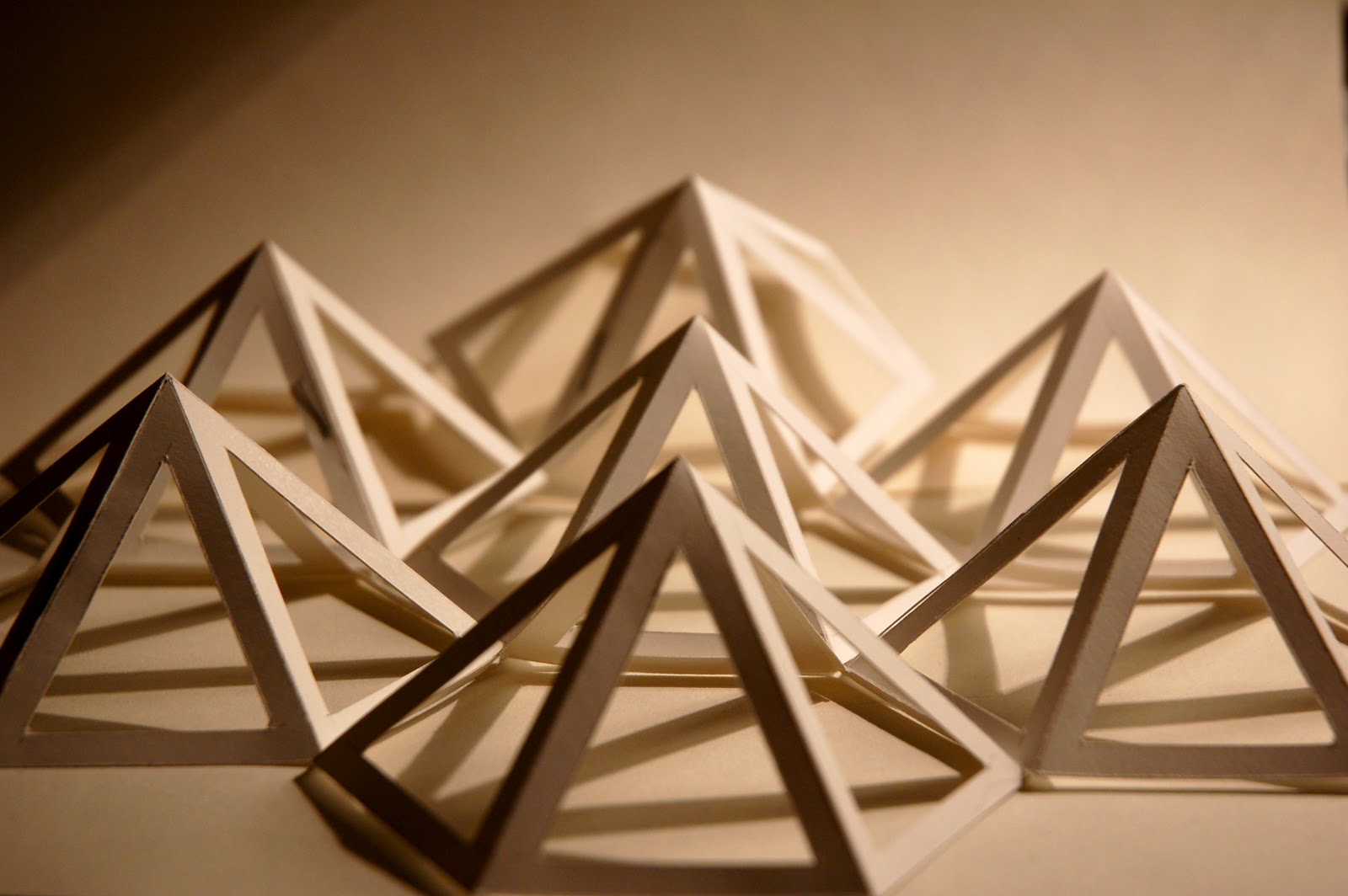
I am very happy with my design. The font colour suits the image as there are a lot of soft tones. I think the image works very well with the text. I have used the golden ratio layout. I believe that my paper mountain range really stands out and catches the viewers eye.

Monday 7 March 2011

Designs


These are some designs that I have made. I have shortlisted these as I am considering to choose one of them as my final design. I think that they are very strong pieces and can be instantly recognised with GF Smith Paper. I have used the image as the main focal point, I have used Arial font too which GF Smith Paper use.


Sunday 6 March 2011

Final Selected Image

Photoshoot


These selected photos are my favourite from my shoot, I think these are the most successful and from these I will choose one to use as my final piece.


Saturday 5 March 2011

Mountains


I thought that I would base my design on mountains as GF Smith Paper are the pioneers/at the peak of their field. Mountain peaks would be fitting as in task 1 I made hexagons which had peaks.

GF Smith Paper Research


From my research GF Smith paper focus mainly on images, layout and simplicity. Most of their pieces they use Arial. I really like these selected pieces of work as they are simple, effective and very eye-catching.

Friday 4 March 2011

Final Sphere


I'm fairly happy with my final outcome. If I had an extra week or so, I would use the same structure but maybe make the pentagon panels a bit more interesting or carve a more ornate pattern/intricate decorative design.